Years ago, before I created jewelry, I was very closed-minded about combining certain colors. I would never have worn red and purple together, for example. Those limitations I imposed upon myself slowly disappeared as my jewelry making became a major part of my life.
Here are a few examples of color combinations that I now love and don't even think twice about! I now think that all colors are meant to be together.
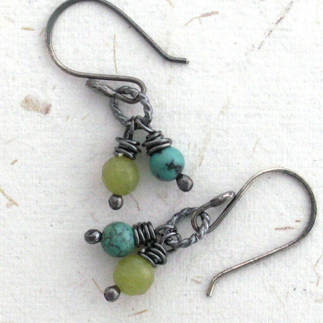
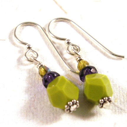
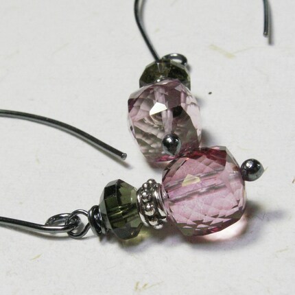
This first pair of earrings features turquoise and olive green serpentine. The next pair pairs a chartreuse green glass bead and deep purple glass. The contrast is wonderful. In the last pair, you see pink quartz and deep, dark green tourmaline.


All of these color combinations are somewhat eclectic, yet they work. One of my favorite reference books for working with color is Colorworks by Deb Menz. Not only is it a great technical resource, but it's inspiring as well. I get lost in the pages of this book and always walk away from it with fresh ideas and swirls of color in my head.

3 comments:
Very nice, Vickie!
Such beautiful jewelry!! :)
I think your metal book is beautiful!
Post a Comment