
Color saturation is the relative brightness or dullness of a color. It is probably easiest to determine the level of color saturation when looking a several samples of color from the same hue family. Colors that are more saturated will stand out more than those that are less saturated.
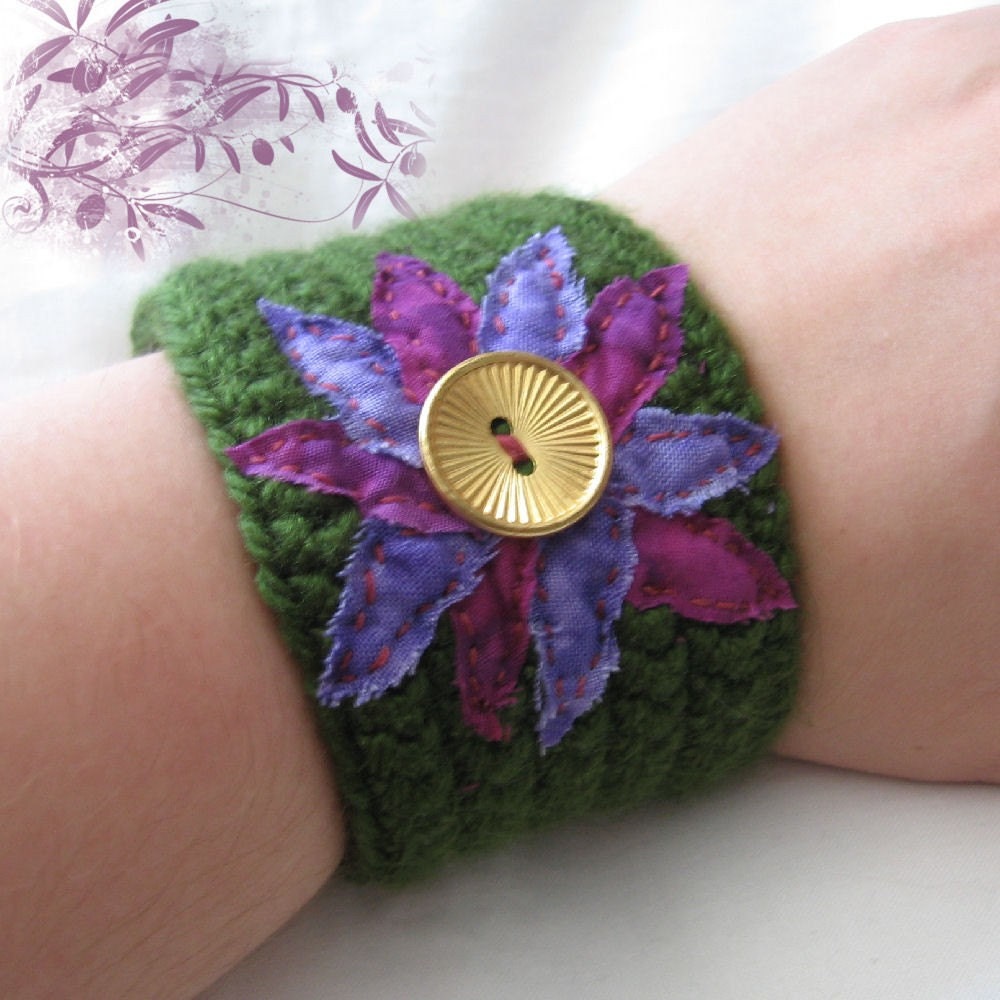
This crocheted wristband from Meri Greenleaf is a great example to illustrate color saturation. The deep purple colored flower petals are far more saturated than the lighter, almost periwinkle colored petals. Both colors are from the violet hue family.
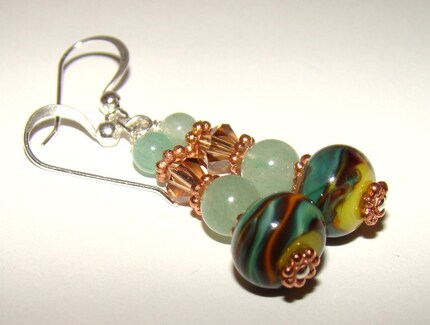
In this pair of earrings from Sue of Signature Sterling, it's easy to see the saturation difference between the deep green lampwork beads at the bottom of the stack as compared the pale green aventurine beads above.
The saturation level of the colors that Brenda of The Jewelry Box chose for these earrings is in a much narrower range. This demonstrates the different looks you can achieve by either keeping your color choices within a narrow range of saturation versus using colors at opposite ends of the saturation scale, as in Sue & Meri's examples above.

1 comment:
Fabulous! Thanks for sharing! (that crochet cuff is just WOW, I have to see more, heading over now)!
Post a Comment