Showing posts with label color theory. Show all posts

Thursday, May 16, 2013

COLOR!

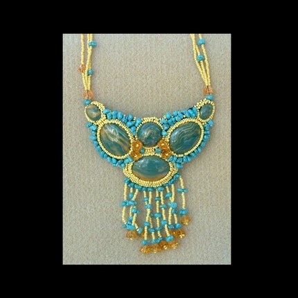
I don't know about you, but I love color. I love almost all colors and I love most of them together. Some of my most popular earrings feature what some would consider bizarre color combinations. Even when these pieces are not big sellers, they are certainly eye-catching and draw customers to a display of all of my jewelry, like at a craft show.

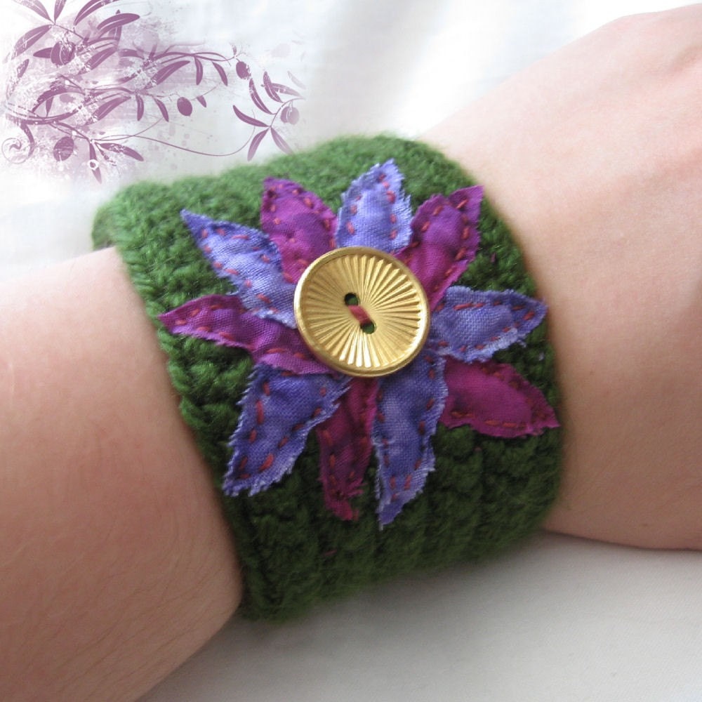
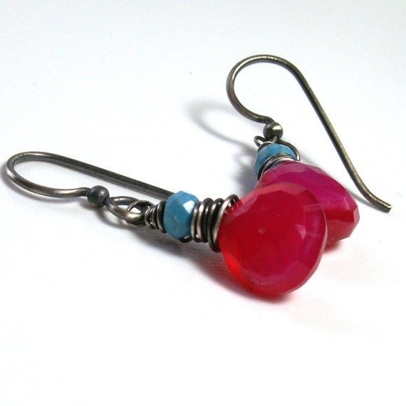
This is what I'm talking about:
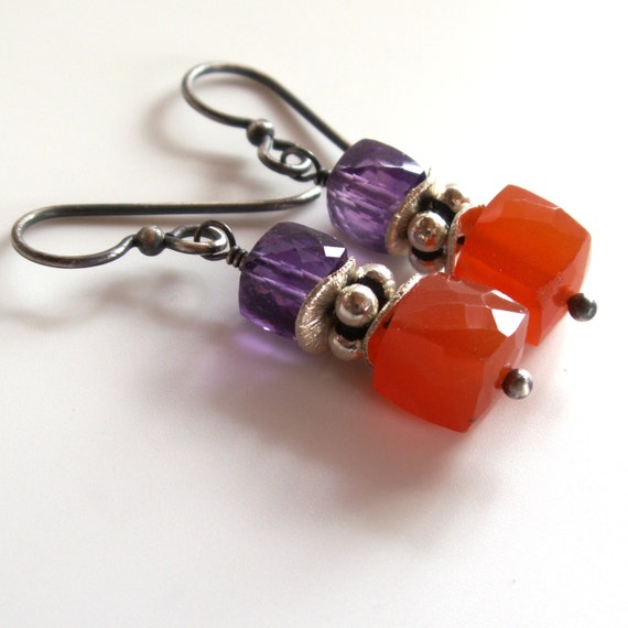


And this too:


If you really want to learn about color theory, get some reasoning behind why these combos work (or don't) you need to head over to my friend Brandi's blog. Not only does she explain color theory in perfectly understandable terms, she offers up some really delicious color palettes based on lovely pieces of art. She also talks about design and photo editing. Trust me, you'll like it over there. She also has a fun Facebook page here.
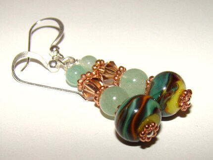
Sunday, November 1, 2009

Color :: Saturation

Once again, I visited the pages of the book Color Works by Deb Menz to gather some information on color saturation. Don't let my postings here prevent you from purchasing this book. There is much more that Deb Menz covers that I can't even begin to understand!

Color saturation is the relative brightness or dullness of a color. It is probably easiest to determine the level of color saturation when looking a several samples of color from the same hue family. Colors that are more saturated will stand out more than those that are less saturated.

This crocheted wristband from Meri Greenleaf is a great example to illustrate color saturation. The deep purple colored flower petals are far more saturated than the lighter, almost periwinkle colored petals. Both colors are from the violet hue family.


In this pair of earrings from Sue of Signature Sterling, it's easy to see the saturation difference between the deep green lampwork beads at the bottom of the stack as compared the pale green aventurine beads above.


The saturation level of the colors that Brenda of The Jewelry Box chose for these earrings is in a much narrower range. This demonstrates the different looks you can achieve by either keeping your color choices within a narrow range of saturation versus using colors at opposite ends of the saturation scale, as in Sue & Meri's examples above.

Thursday, October 29, 2009

Color :: Value

You may have noticed that link on the right to the Artisan Beaders Blog. My teammates and I maintain that interesting informative blog. I've been organizing and posting many of the "Technique Tuesday" posts over there. This post was originally published there, but I thought my readers here might enjoy it too.


I own several books on color theory, but my favorite by far is Color Works by Deb Menz. It not only covers the basics, but it goes far beyond that. And, it is specifically written for crafters of all sorts including beaders, quilters, knitters, weavers and spinners.

One of the most important things I've learned from this book is the concept of value. Value is a comparison of a color to a gray scale. One of the many fun interactive tools in the book is aimed at helping determine the value of a color by providing a gray scale like this:


Deb Menz suggests squinting a bit when comparing a color to this gray scale because squinting restricts the part of your eye that sees color. Using this scale may take some practice.

Why is it important to understand the value of a color? Because value is the first characteristic of a piece of art that you will notice, especially when viewed from a distance. Think about how certain colors "pop" when used with certain other colors. Look at this elaborate bead embroidered piece by Deb of Rosevine Design:


The first thing that catches the eye is the yellow, which generally has the lowest value of all colors on the color wheel.

The same color "pop" happens with the orange-yellow flowers on the left side of this fused glass night light from Deronda Designs:


The way I use this information in my jewelry and other art works is to first determine what affect I'm trying to achieve. If I want a soft, muted piece, I limit my color choices to a small range of values. When I want to assure that a certain part of a piece gets noticed, I venture into a very different range of value for that part.